An Artful Home: Exploring Josh Young's Creative Vision


Photography by Kirsten Francis
Our product recommendations include items from our sponsors and/or contain affiliate links, which means we may earn a commission when purchases are made. Rest assured, every item is genuinely chosen by our editorial team.
In Artful Home, artist and designer Josh Young invites readers into his world of serene and modern classicism. Known for his fine art and beautifully curated homes, Young’s debut book celebrates his signature aesthetic, offering insights into his creative process. Organized around his five guiding principles—palette, texture, form, layers, and nostalgia—the book explores how these elements shape everything from his portraiture and collages to the design of his DC townhouse and his historic country retreat, Sycamore House. The following excerpt highlights these principles and their influence on his approach to artful living.


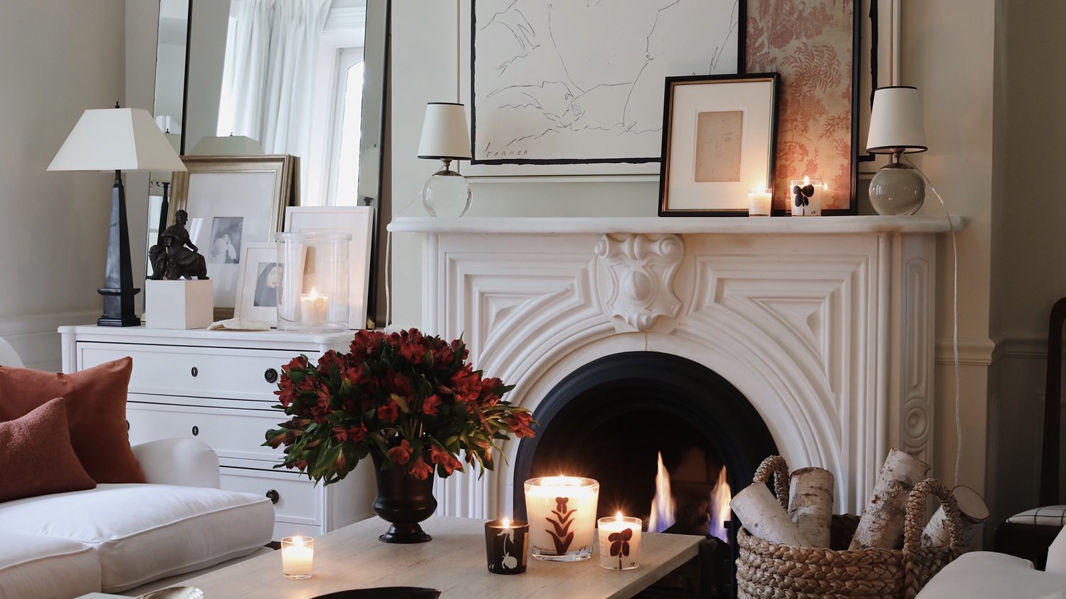
The main entrance at Sycamore House and the adjoining formal dining room are a great example of line, form, and contrast at work.
Palette
One of my favorite things to do is to lay out a variety of objects and see how their colors work with one another. Observing the way textiles or tubes of paint interact has always intrigued me. Whether I’m in the studio beginning a new painting or sourcing for an upcoming interior project, I begin by establishing the palette. There’s a certain magic that occurs when the right combination results in harmony and balance.
Palette matters. Used repeatedly, a set of colors can become a recognizable part of one's design DNA. A specific and intentional palette helps to tell a story and create a mood. In my work, I look to neutrals and a monochromatic, restrained arrangement of color. Regardless of trends, neutrals—off-white, ivory, ecru, tan, and brown—are my go-to. It’s a subtle range that feels natural, light, and grounded. These combinations are instinctual to me. Identifying my personal palette was key to establishing my own signature look.
As much as I love neutrals, I don’t avoid color. However, I apply the same discipline and restraint to working with color that I do with neutrals. Ever the purist, I love each color to have its own moment—to be appreciated and prominent on its own without competition. For me, adding too much color to a room creates noise and a heightened sense of visual distraction. I can certainly appreciate it, and I love to visit rooms filled with it. But I can't live in it. In my home, I use a single shade in a room, allowing it to take center stage through something as simple as upholstery or paint on the walls. When everything else around the color is kept more subdued, the color acts as a neutral.
Texture
My love of texture intensified during the years I spent living in Milan. The stucco and plaster buildings that lined the city’s streets captivated me with their stature, elegance, and refined details. The characteristic that left the biggest impact on me, however, was their decay and dilapidation. Large, broad swaths of plaster chipping away from the facades, exposing years’ worth of paint, stone, and brick. These buildings were a true testament to the city’s age, existence, and depth. The textures added a layer of complexity that made the buildings and the city more beautiful.
Texture has always taken center stage in my creative process, whether in my art, my home, or other parts of my life. Texture can enhance a piece of art, resulting in a more substantial and impactful work. Among other things, texture makes a painting come alive. Texture is the antithesis of sterility. Its beauty lies in its unique ability to stimulate both visually and tactilely. It allows one’s eye to “feel.”
I approach an empty room the same way I approach a blank canvas: I begin with texture. I consider how I want a space to feel both visually and tangibly. First impressions are everything, and when entering a room my eyes want to travel. As they roam from object to object, I’m dissecting the physical makeup of the items in the room and the sensations they evoke. Smooth and rough. Varnished and tarnished. Rigid and sleek. After taking that quick, visual snapshot, I assess the materials and textures and how they work together. Curating the textures of a room is key to making it feel elegant and intentional. They say the devil is in the details, and this aspect of design is a detail not to be overlooked.

The creamy painted door, original rustic hardware, and rough-hewn fieldstone are a study in contrasts.

The kitchen at Sycamore House features custom cabinetry and an island painted in a warm, deep red for a bit of color.

Open shelves of white dinnerware, silver, and stemware stand aside the original wooden exterior doors and frame from 1780 that lead to the basement and storage area of Sycamore House.
Form
For as long as I can remember, I’ve been acutely aware of shapes and forms. Indeed, that awareness was a strong motivator that led me to become an artist. When I was young and first studying the great abstract expressionists, I was captivated by their use and manipulation of line and shape. This awakening led me to become hyper-aware of various shapes and forms and how I use them in my work and projects today.
I’m often asked what is most important when grouping and curating pieces for a room. The answer is always the same: form. Whether I’m painting or designing an interior, I consider how forms, lines, and silhouettes interact. Combining them is a juggling act, but one I enjoy. You need some commonality, but also juxtaposition of different shapes in a space. And feeling them click into place is wonderful. The mix entertains the eye—when it works, looking at it is like attending a dance performance.
The shapes and forms I include on a canvas define the overall feeling and mood of a piece. Geometric, angular forms add a sense of structure and tension, while round shapes add fluidity and ease. Some forms bring in visual weight, while others contribute balance and movement. It all depends on their placement and how they coexist with one another.
Layers
I’m naturally drawn to a sense of depth and dimension in almost everything. Layers Foster intricacy and complexity. This can apply to artwork, interiors, and even how we dress.
I started painting when I was eleven years old. My parents built my first studio in a small corner of the basement of my childhood home. It became my refuge, a place I escaped to after school and where I got completely lost creating anything I wanted. At that same time, I began collecting books about various styles of art and the masters whose works I was drawn to. In my studio, I would analyze the images in those books, dissecting the artists’ techniques, colors, and elements.
My first loves were the Impressionists, with their ability to layer paint on a canvas to a point where the artwork itself became three-dimensional. Large swaths of paint billowed off the foregrounds of their works, mimicking crashing waves or rolling clouds. My older cousin Michelle, who was an artist herself, taught me to layer colors onto the canvas liberally, naturally applying depth to the composition with palette knives. During my high school years, I fell in love with cubism and pop art. I learned that my work did not have to be limited to paint on a canvas. I explored a mixed-media approach by incorporating everything and anything that I could get my hands on and layering it on the canvas. Old newspapers, linen, string, wire mesh, even old, rusted nails that I found in my dad’s red toolbox. If it could be glued and painted, it was fair game.

"Although we call this place the summer room, it is especially cozy on a crisp fall day when the dramatic, oversized fireplace blazes with a roaring fire," says Young. "The smell of firewood instantly transports me to my childhood."
Nostalgia
For me, nostalgia is about cultivating a sense of warmth and comfort. A respite that allows space to dream. Escapism from the day-to-day. It’s walking into a room and being surrounded by objects or things that hold sentimentality and significance. Evoking a feeling of history while still being rooted in the present.
In the seventeenth century, nostalgia was often linked to depression and melancholia. For some, that could very well be the case, but I like to think of nostalgia as less about fixating on what was and more about romanticizing a feeling of what may have been. Pulling and referencing elements from the past that we find enjoyable and satisfying. Going beyond just the aesthetically pleasing and creating a world with depth and meaning.
I’ve always been observant of my surroundings. Even when I was a child, family and friends would remark on my ability to recall an experience or a place in great detail. Extremely in tune with my senses and aware of the influence they have on my overall mood and creativity, I’m also the type of person who feels their way through life. Songs, a fragrance, a film, or a place immediately connect me to specific memories. I tend to link a certain amount of sentimentality to people, places, and things, and I look to have that nostalgia translated and represented in both my artwork and my interiors.
“I like to think of nostalgia as less about fixating on what was and more about romanticizing a feeling of what may have been. Pulling and referencing elements from the past that we find enjoyable and satisfying. ”

An eighteenth-century portrait of Diana the Huntress hangs above one of Sycamore House's five original woodburning fireplaces and greets all who enter the living room.

In the primary bedroom at Sycamore House, the bed curtains nod to the room's past.

Want More of Josh’s Signature Style?
Join Josh Young and Lonny editor Michelle Adams on September 19th at the Rizzoli bookstore in New York City to celebrate the release of Artful Home. Doors open at 5:30pm.